2015 CCHS Nutrition Survey Visualized in Tableau
OK. So the first Tableau visualization I got done wasn't anything too thrilling. That's because it was for government work. However, it was with data just two days old, and public data from Statistics Canada that's cumbersome to do analysis on, or even analytics to show what's in there and quickly see what it all means, so there's value in it. StatCan has also never done anything like this publicly with their data, which they should because those CANSIM tables they have are inaccessible in a practical sense to the vast majority of the public. I'm betting the public would love their work a lot more if they visualized all their work to make it interactive and easy to understand like this! Maybe they could hire me to do this full time with all the data they released! :)
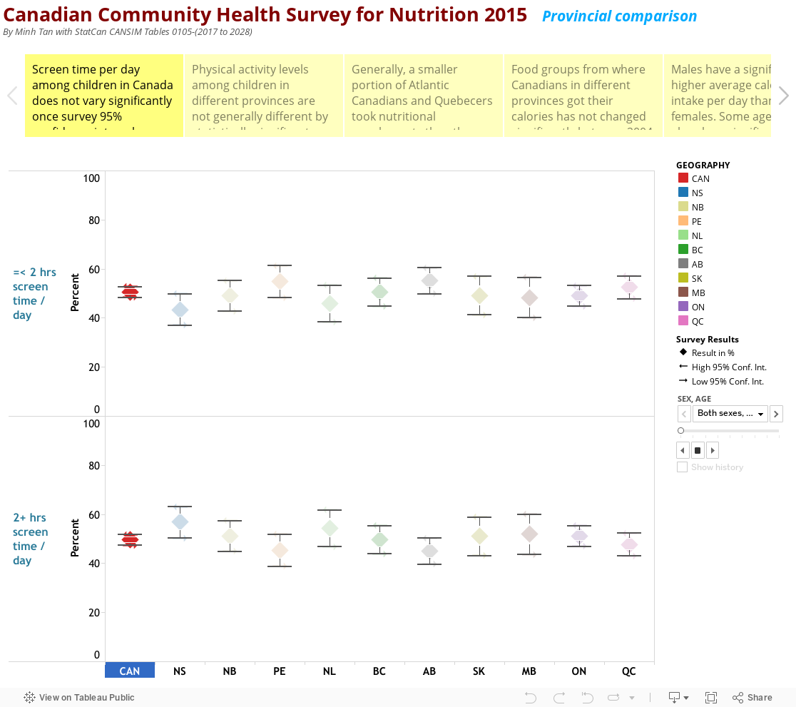
The 2015 Canadian Community Health (CCHS) Nutrition Survey seemed to have been one of these horribly complex surveys that will ultimately yield very little useful data unless you really work hard for it. That's because things had to be compensated for everywhere, and compensation to compensate for those compensation had to be done everywhere else! A list of 9213 foods was available for trying to determine nutritional intake based on past 24 hour memory, done twice to help with consistency and accuracy, but only with 2/3 of the original participants due to inability to get the remaining third to provide answers for one reason or another... likely and another.
Anyway, what was done and released as public data in CANSIM tables was what I used to put this story "viz" together on Tableau. If more CANSIM tables get released later on the survey, I will update this likely with a new one as I was using version 9.1 when version 10.3 is out. I just haven't gotten it yet at work.
This is pretty much just a showing of what's in the data, with some rather sterile and obvious conclusions drawn that anyone with very basic understanding of survey results would be able to make. There's nothing political or ideological about any of it, and it is public data so despite it being in my field of work, nobody can complain about it being inappropriate, a conflict of interest or not in my rights or professionalism to be doing.
There'll be a small bunch of much more exciting visualizations coming from me over the next month or so on much more interesting topics, from the weather to electricity use (correlated to weather) to an NHL hockey draft performance assessment I developed! Even the one with the public regular CCHS data should be much more interesting than this one! Hope you'll come back to check them out!
Enjoy!


Comments
Post a Comment